One way to create professional-looking programs is to pay attention to design details. The appearance of text, including font choice and attention to typographical details, is just one way to put polish on your software. Many of the tips below are taken from a great little book, The Mac is not a typewriter, by Robin Williams. Even though it was published in 1990 and is oriented toward desktop publishing, it still contains some great pointers for developers creating on-screen text.
Use only one space between sentences. The old standard of two spaces was based on monospaced typewriter fonts. Modern computer fonts are proportionally spaced, and the space character is designed to produce the proper amount of white space between sentences.
"Straight" vs. “curly” quotes: When typewriters were invented, there was a need to adapt the large character set available to typesetters to the extremely limited character set available on the typewriter. Typists had to create compromises to convey the desired character. One casualty was the so-called “curled” double and single quotes. Instead of the elegant curved open and close quote sets we see in printed materials ( “ and ” or ‘ and ’ ), typewriters offered only a single, straight version of the single ( ' ) or double ( " ) quote. When GUI-based operating systems came along, they offered a vastly larger character set that included curled quotes, but typists continued using the straight quotes out of habit and convenience. The Web further reinforced this bad habit, because text on the web gravitates to the reliably-standard lower-ASCII character set.
Use of curled quotes for quotation marks and apostrophes will make your text look more professional and polished, but you have to train yourself to use them. Most modern operating systems allow you to produce these characters using simple key combinations.
| To type: | Macintosh | Windows |
“ |
option + [ | alt + 0147 |
” |
shift + option + [ | alt + 0148 |
‘ |
option + ] | alt + 0145 |
’ |
shift + option + ] | alt + 0146 |
In many cross-platform settings, notably the Web and email, upper-ASCII characters like this get scrambled and show up as strange characters in the text. Fortunately, since text in LiveCode is unicode-based (as of Livecode 7) symbols such as curled quotes should be rendered properly on all host operating systems.
hyphen — For hyphenating words and line breaks.
Examples:
He has a devil-may-care attitude.
full-time, part-time, mother-in-law twenty-three, ex-wife, self-evident
Use a hyphen to divide a word at a line break. Some programs will auto-
matically hyphenate for you.
en dash — About the width of the letter n in the chosen font and size. Used between words or numbers to indicate duration.
Examples:
October – December
7:30 – 9:45 a.m.
3 – 5 years of age
Matthew 16:15–20
em dash — About the width of the letter m (the widest letter) in the chosen font and size. It is used:
Don’t use a double hyphen (--) in these situations. That’s another throwback to the typewriter.
Examples:
John’s hope—his only hope—was to reach the lake before sundown.
His tale lacked just one thing—credibility.
Never use underlining for emphasis or titles—that’s a relic from typewriter days. Use bold or italic instead.
You should very rarely use ALL CAPITAL letters. Mixed upper and lower case letters create letter and word shapes that help us read more easily. The following word block puzzles illustrate how it is possible to figure out text using only the varying blocks of space that letters occupy. These are well-known English proverbs. See if you can figure out what they are. Type your answers in the text fields before you check the solution.
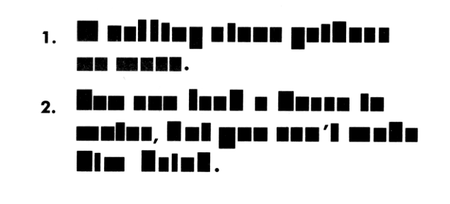
Source: Williams, The Mac is not a typewriter, p. 32.
1.
2.
(Note: Some of the following examples are tagged to be rendered in the named fonts, but will only show up as such if you have those fonts installed on your system.)
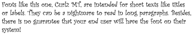
There are thousands of fonts to choose from. Each has a different feel and character. Each font can portray a different mood. There are many display and novelty fonts that are designed to be used for captions or titles only. Avoid using such fonts for long texts. Check out this sample:
Serif vs. san-serif fonts – serifs are small extensions or “flags” on the ends of letters. Compare Times New Roman and Arial, e.g.
This is Times New Roman, a serif font.
This is Arial, a sans-serif font.
There are also “hybrid” fonts, e.g., Optima, which are nominally sans-serif, but whose ends are subtly tapered to give the impression of serifs.
The traditional assumption is that serif fonts are easier to read in long passages; sans serif are more legible, so more suited in titles and signage. But more recent studies on readability on the computer screen hint that fonts designed specifically for the computer screen may be easier to read on screen. Here are some prominent examples. Note that the fonts designed for on-screen use appear slightly larger and give more space to individual letters.
Serif – Georgia (screen) vs. Times New Roman (print)
Sans-serif – Verdana (screen) vs. Arial or Helvetica (print)
One survey of readability studies (http://alexpoole.info/blog/which-are-more-legible-serif-or-sans-serif-typefaces/) concludes that there is no convincing evidence to support the superiority of one style over the other. Furthermore, it is probable that a combination of font design factors may be more important than the simple presence or absence of serifs. However, the clear trend on the web is toward greater use of sans-serif fonts for body text. This may suggest that using serif fonts for screen text may appear more old-fashioned than using serif fonts.
This is another area in which there is a great variation in readability between print and on-screen text. Since print is much higher definition—300 dpi or greater—9 or 10 point font sizes work well. On-screen text is much lower resolution—between 72 and 96—and font sizes need to be commensurately larger to be readable. The most common choices on web pages, for example, seem to be 12 or 14 point, depending on the font.
Keep in mind that font size is not consistent between fonts. Some fonts are just larger by design, so the point sizes are relative within the font. For example, Verdana 12 appears much larger than Times New Roman 12 or Arial 12. In addition, font sizes on Windows systems tend to be rendered much smaller than the same font and sizes on Macintosh systems.
It is important to maintain a high degree of contrast between text and background. Most studies seem to indicate that dark text on a light background is the best combination. Black text on white is the most common choice.
Robin Williams, The Mac is not a typewriter. Peachpit Press, 1990.
Robin Williams, The Non-Designer’s Type Book. Peachpit Press, 1998.
http://alexpoole.info/blog/which-are-more-legible-serif-or-sans-serif-typefaces/
http://www.webdesignfromscratch.com/readability.cfm
http://psychology.wichita.edu/surl/usabilitynews/52/UK_font.htm
1. A rolling stone gathers no moss.
2. You can lead a horse to water, but you can’t make him drink.