Back
BYU LiveCode Lessons Gateway
DigHT 310
Menus and the Menubar
Menus are an important part of the graphical user interface (GUI). There are a number of different menu-like controls that you can incorporate into your application. There are also menubars, which are found at the top of the screen in the Macintosh OS and at the top of each window in Windows and various Unix GUIs. Although they function in essentially the same way across platforms, there are small but important differences in the way menubars are laid out on the Mac platform versus the Windows and Unix platforms.
Menu-style Controls
The most important thing to remember about "menu" controls is that they are actually a special class of buttons—specifically, buttons whose style property is set to menu. That means you refer to them as buttons and that they can respond to any message a button responds to. But menu-style buttons look and behave as various types of menu controls. Their specific appearance behavior is determined by their menuMode property. This property can be set when creating menu buttons—by dragging one from the tool palette or by choosing a menu-style button from the Object menu > New Control.
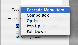
| There are six types of menu-style buttons: the five listed in figure 2, plus one called "tabbed". It is not listed in the menuMode options, perhaps because it is quite different in appearance and behavior than other menu buttons, but it is similar enough that we will look at it here with all of the menu-style buttons. Once a menu-style button has been created you can change its mode in the property inspector (see figure 2.) |
 |
| |
Fig. 2 - Menu mode options in property inspector |
|
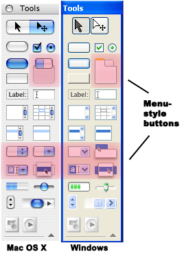
Fig. 1 - Menu buttons on the tool palette |
| Here is a rundown of the various types of menu-style buttons and their primary uses. Mac OS X and Windows XP examples appear to the right of descriptions. |
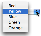
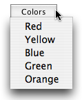
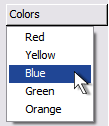
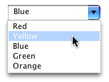
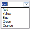
- Option menu: "popup" menu for choosing between a number of options.
- Examples - Navigating up the file hierarchy in an Open or Save dialog.
LiveCode Preferences > Appearance.
|
 |
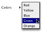
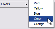
- Pulldown menu: Used to create standard menus (see menubars section below.)
- Example - Standard application menubars (Mac) or Window menubars (Windows.)
|
 |
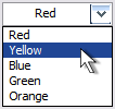
- Combo Box: sort of a hybrid field-menu. Like an option menu, in that it has options to select from, but also lets you type into the box, as in a field.
- Note: Combo Box menus also receive field messages!
- Note 2: In some quarters combo box menus are considered bad interface design precisely because they confuse the distinction between buttons and fields.
- Example - Some apps, including LiveCode, use this for text font and size selections.
|
 |
Cascading menu item: Used to create hierarchical menu items in standard menus. |
 |
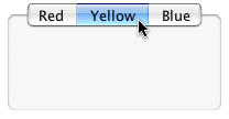
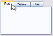
- Tabbed: Presents the menu items as labels on a horizontal list of tabs. Usually used to present a different group of controls for each tab.
- Example - often used in preference windows to present different groups of options. See OS X System Preferences —International
Windows XP Control Panel—Internet Properties
|
 |
- Popup Menu: Pops up a list to select at the point of the mouseClick. No arrows or borders. Usually hidden and used in conjunction with the
popup command.
- Example - right click contextual menus.
|
 |
Note that menus are presented using the native look and feel of the host operating system.
Tools in the Scripting Language for Working with Menus
the menuPick message — The message you normally handle when creating menu style buttons (although menu buttons do receive all standard button messages.) The text of the chosen item is automatically sent as a parameter along with the message. Typically, inside the menuPick handler you would use a switch control structure to determine what happens when each menu item is chosen.
the menuHistory property — Holds the line number of the last item selected. Can be read or set.
the selectedLine — returns a chunk expression in the form 'line n of button m' describing the selected line of the menu button.
the label — for Option Menu and Combo Box styles the label of the menu button changes to the last item chosen.
the popup command — Used to display contextual menus. Displays a popup menu whose choices are the lines of a button (or buttons in a stack)
Menubars
Menubars in LiveCode are composed of a collection of pulldown style menu buttons. As you would suspect, LiveCode provides tools for creating custom menubars
for your own stacks. The menubar you see as you are developing stacks in the
LiveCode development environment will not be present in a standalone
application created from the stack. Instead, the stack will display the menubars that
you create during the development process, if any. The LiveCode documentation
contains an excellent overview of menus and how to create them. It is a good
idea to read through section 7.13 of the LiveCode User Guide: Programming Menus & Menu Bars. This can be found in LiveCode
Documentation > User Guide. The following activity is based on the information
presented in that section and is designed to take you through the
basic
steps
of creating
and scripting custom menus.
Activity: Creating a Menubar
I. Create the menu:
- Remember that menus are actually specialized buttons. Create the following
menu style buttons, taking care to do it in the order described here. (You'll
see later that this is important to maintaining cross-platform menu consistency.)
- Create a Button called "File" of style menu, with the button's menuMode
property set to pulldown. You can do this automatically by choosing the
Pulldown Menu tool from the Tools Palette or choosing Object
> New Control > Pulldown menu from the menu. Set the menu button's border
to off.
- Create a button "Edit" with the same style and menuMode.
- Create a button called "Colors" with the same style and menuMode.
- Create a button called "Help" with the same style and menuMode.
- Use the alignment palette to set their tops even and lined up edge to edge.
- Group the menu buttons into a group called "myCustomMenu".
- Move the new menu up to the top left corner of the card window, like a Windows
menu. Make sure there is room at the top of the card for the menu (all
other objects on the card should be below that.)
II. Create menu items
- Enter "Select Grouped Controls" mode (from edit menu or by clicking on the
Select Grouped tool on the Toolbar.)
- Select the File menu and open its property inspector. Make sure the Basic
Properties panel is showing.
- Select the Menu Items choice, then type in the items that should be
in the menu, one per line. (Note: The contents of a button can be treated
just like the text in a
field. You can put text into, before or after a button. You can get the
text of
a button and put it into any other container, such as a field, variable,
etc. Note, however, that buttons do not have field properties like htmlText
and unicodeText.)
- Type into the File menu contents (Remember to separate them by returns):
Open... Close and Quit. Into the Edit menu: Cut Copy Paste, Clear, and
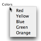
Preferences. Into the Colors menu: Red Yellow Green Blue. Into the Help
menu: Show Tool Tips, About. After you have typed these items they show
up when the mouse button is held down over the
button.
III. Put dividers into menu
- Select the Edit menu button, open its Properties Inspector
and position the insert cursor after Paste in the Menu Items field.
- Press return and type a hyphen (-) on the new line.
- Now check the Edit menu. A divider line has been added after Paste.
- Using the same procedure, place a divider after Close in the File menu
button and before About in the Help menu button.
IV. Add messages/commands to menu items when they are chosen
- When a user chooses an item from a menu LiveCode sends a
menuPick message, along with a parameter that is the name of the menu item chosen.
- Open the script editor for the File menu and enter the following script:
on menuPick itemPicked
  switch itemPicked
  case "Open..."
    -- do open stuff here
    break
  case "Close"
    -- do close stuff here
    break
  case "Quit"
    -- do quit stuff here
    break
  end switch
end menuPick
- Create a similar script for each menu, substituting the name of each menu
item in the
case lines.
V. Placing special characters in menu items
Placing the following special characters (note: they are case sensitive) in front of a menu item has the following effects:
	!c - checks the menu item
	!n - unchecks the menu item
	!r - places a diamond before the menu item
	!u - removes the diamond
	(- disables the menu item
Putting the & character before any character anywhere in a line underlines
the next character and makes it the keyboard mnemonic for that menu item on
Windows systems.
Putting the / character anywhere in a line makes the next character the keyboard
equivalent for the menu item.
&Quit/Q - Gives the menu item a Windows keyboard mnemonic
of Q and a Command (Mac)/Control (Windows) key + Q keyboard shortcut.
Experiment with these special characters on some of the menu items.
VI. Disable/Enable a menu item
You can either put or remove the '(' before the menu item, or you can use this
format:
disable menuItem 1 of btn "Edit"
VII. Disable/Enable an entire menu
Use the enable/disable button command
 disable btn "Colors"
 enable btn "Colors"
VIII. Delete items from a menu
delete line 3 of btn "Colors"
IX. Creating cascading menus
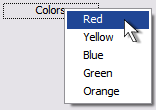
- Open the properties palette for the Colors menu and edit the button contents
(in the Basic tab).
- Add a line after "Red" and press Tab, then type "Orange". This creates a Hierarchical or Cascading menu.
- When you choose a cascaded menu item it is sent by the menuPick message
in this format:
"Red|Orange".
X. Setting the font of menus
The font of the menu is the font of the button. You should set it to the standard menu font for Windows: MS Sans Serif. When used as a standard Mac menu on a Mac system it will use the menu font that is set by the system
XI. Setting the color of menus and menu items
Set the color of the button background and foreground.
When used as a standard Mac menu on a Mac system it will use the menu color that
is set by the system
XII. Making a menu that conforms to various OS standards
Use the command
set the menubar of this stack to "myMenu"
In the Mac OS the Quit, Preferences, and About menu items appear in standard
menu locations for all applications. When you set the menubar of a stack,
LiveCode automatically places these items in the proper menu locations,
while still maintaining their places in the menus under Windows and Unix.
This eases the process of creating cross-platform applications.
XIII. Using the Menu Builder
The Menu Builder is a tool that automates the process of creating and
configuring menus. It can also help you to set the
proper type
of menu for Mac vs. Windows environments. The menu manager is found in the
Tools menu. When you open it, you may create a new menu or choose to edit an
existing menu. You will notice that most of the features of the menu that you
set manually above can in most cases be accomplished more quickly using the Menu Builder.
Back
BYU LiveCode Lessons Gateway
Maintained by
Devin Asay.
Copyright © 2005 Brigham Young University
 Office of Digital Humanities