 Office of Digital Humanities
With LiveCode v. 8, an exciting new control type was introduced—the widget. Widget is a catch-all term for objects that are more complex than the standard native controls, and more suited for very specific tasks. LiveCode v. 8 and 9 come with the following widgets:
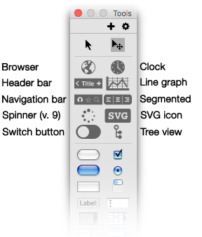
Fig. 1. Widget controls
on the Tools palette
In recent releases of LiveCode widgets specialized for various operating systems have appeared. For example, there is an iOS native button widget, which creates a native button when the host stack is run on iOS devices, and Android Native Button and Android Native Field widgets, which display these native controls when the stack is run on Android devices. The native field widget gives you all the affordances of an Android field, such as spelling suggestions as you type.
In addition to these standard widgets, LiveCode offers an extensions store where a small but growing collection of community-produced widgets are available. For example, a calendar widget and a circular progress indicator widget are in the works.
Several of these widgets are especially designed to create a more mobile-specific themed user interface. These include the header bar, the navigation bar, the switch button, and the segmented control. Here are some sample app interfaces using widgets with mobile themes set.
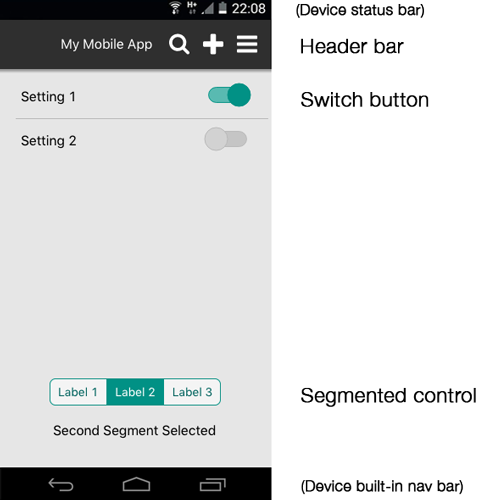
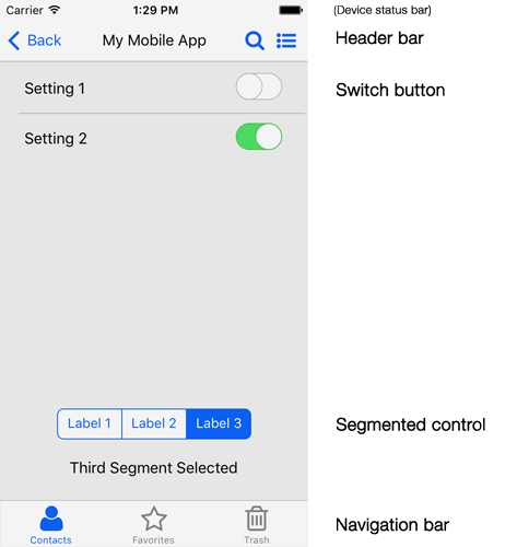
Fig. 2. Themed widgets can be used to create native-looking interfaces on mobile platforms
Left: iOS theme — Right: Android theme
Widget properties. Each widget is designed and programmed to be a self-contained object. This means that properties that can be set for a given widget are very specific to that widget, much more so than with native LiveCode objects like buttons and fields. Thus, only some widgets have mobile platform themes like those shown above. Within each theme, specific properties like colors, icons, and labels can be set as desired to conform to iOS and Android user interface guidelines.
Scripting widgets. Similarly, clicks or touches on widgets generate messages that are specifically programmed into the widget; they do not generate the full complement of mouse messages that we are used to encountering with native LiveCode objects.
For example, the Header bar widget is a sort of combination title bar and mode selection bar that can display one or several icons. But instead of responding to the full complement of mouse messages, clicks on icons in a header bar generate only a mouseUp message. Within the mouseUp handler you can check the mouseAction property, which gives the name of the header element (called the "action") that the mouse is over when the click is made. In the navigation bar widget above there are three labeled icons. A click on the navigation bar would generate a mouseUp message, for which you could write a handler like this:
You could handle clicks on the header bar with this handler:
on mouseUp
  put the mouseAction of me into tAction
  switch tAction
    case "back"
       # scripting for the Back action goes here
       break
    case "search"
       # scripting for Search action goes here
       break
    case "menu"
       # scripting for Menu action goes here
       break
    end switch
end mouseUp
A Navigation bar widget is a button bar on which you can display navigation icons. This kind of navigation bar is more typically seen in iOS apps rather than Android apps. Clicks on a Navigation bar widget generate only a single message: hiliteChanged. The Navigation bar's hilitedItemName property returns the name of the icon clicked on, so you could script a Navigation bar like this:
on hiliteChanged
  put the hilitedItemName of me into tItemClicked
  switch tItemClicked
    case "contacts"
      # scripting for the contacts icon goes here
      break
    case "favorites"
      # scripting for the favorites icon goes here
      break
    case "trash"
      # scripting for the trash icon goes here
      break
  end switch
end hiliteChanged
Because each widget is specialized, each widget type is fully documented in the LiveCode the LiveCode Dictionary, where all the properties and messages that the widget supports are listed. For instance, if you click the filter on the Dictionary page (under Associations) for the Switch Button widget, you'll get a list of several properties and one message supported by this widget. Here's a sampling:
Properties
the highlight (hilite) – true if switch is in On position; false if switch is in Off position.

the theme – the widget can be themed as "iOS", "Android", or "native". When native is set,
the widget will conform its appearance to the host OS.

the showBorder – determines whether the switch button has a border
around it or not.

Message
on hiliteChanged - sent when the switch is changed from one position to another.
When you want to use a widget, a quick check of the Dictionary will give you an idea of what it’s for, the properties you can set for it, and the messages you can use to script it.