By the end of this lesson you should:
Just as Lego blocks can have different
characteristics, so can LiveCode objects
As mentioned in the previous lecture, objects are the basic building blocks in the LiveCode authoring environment. There are several different types of objects: stacks, cards, buttons, fields, graphics, etc. Apart from being fundamentally dissimilar, they also have characteristic variances within object types. Just like Lego blocks, these objects all come in different shapes, sizes, and colors. In LiveCode, these characteristics are called properties.
All objects in LiveCode have properties or distinct characteristics that determine how they appear and behave. As with Legos the objects can be very generic or very specialized, all depending upon what the specific properties of the object are.
You can access an object’s properties easily by double-clicking on the desired object with the pointer tool while in edit mode, or by selecting the appropriate inspector under the Object menu. This will cause the properties of the particular object to be displayed in the Property Inspector palette.
Once the Property Inspector is visible, each time a different object is selected with the pointer tool (or with the selector option in the top right of the inspector palette), the inspector changes to display the properties for that object. Let’s look first at properties common to all objects, and then move into important properties that are unique to various objects.
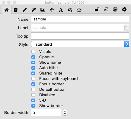
Property inspector for a button object.
This is the Basic Properties tab.
The Basic Properties Tab
You should be aware that most objects share several common, basic properties. Several of these common properties are found in the Basic Properties pane of the property inspector. Some of the other common properties are found in other sections of the property inspector.
For objects that have borders, fields and buttons, for example, the following properties apply:
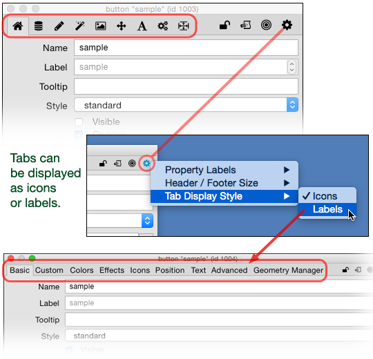
The tab bar at the top of the property inspector
lets you switch between the various sections
of property sets. You can also choose how you
want the tabs displayed.
Property Inspector Sections
The properties for each object have been organized into different sections. The tabs at the top of the inspector allow you to switch between various property sets. By default the Basic Properties is selected the first time the inspector is opened (as displayed above). The different sections available vary according to the type of object selected.
The settings (gear) icon in the inspector header allows you to display the tabs as icons or labels, according to your preference. Notice that the same settings icon also allows you to change the size of the header.
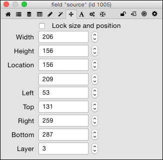
Virtually all LiveCode objects have these
size and position properties.
Size & Position Properties
In the Size & Position tab of the property inspector we find the following common properties, which pertain to almost all LiveCode objects:
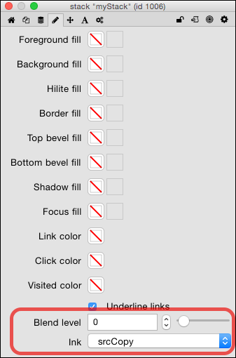
You can set the transparency level of
LiveCode objects in the Colors tab
of the property inspector.
Colors and Blending
For most LiveCode objects you can set colors of the border, the interior fill and other aspects of the objects. We will discuss color settings in greater depth later in this lesson.
In addition all LiveCode objects can have a blend or transparency level. The controls for setting the blend level are at the bottom of the Colors tab.
There are a few other common properties, which will be addressed in Inheritance section below.
If you watch the Property Inspector window as you select different objects, you will see that the properties displayed change according to the type of object selected, sometimes quite drastically. For now we will cover only certain commonly used properties. Some properties are more or less self-explanatory and will not be covered in depth here. The best way to learn about properties is by exploring property inspectors for objects on your own in LiveCode. That said, let’s look at a few properties that are unique to the various object types, and which are important to know about.
Stack
A few stack properties you should be aware of:
- Basic Properties: Title. Give every stack you make a meaningful Title. This is the text displayed in the title bar of your stack. If you do not, it displays the file name you have assigned the stack with an asterisk reminding you that you have not given it a title. In other words, it looks unfinished to leave a stack without a title.
- Basic Properties: Purge stack on close. When this property is off (unchecked), if you close a stack it remains loaded in memory. When this property is on (checked), if you close the stack it is removed from memory. For beginners it is probably best to turn this property on.
- Size & Position: Resizable. This is checked by default, allowing you to drag the edge of the stack window to change the dimensions of the stack (the cards assume the same size as the stack). Once you have the desired dimensions for your stack, it is best to uncheck this box, unless you want to allow the user to alter the size of your stack.
Card
A couple of important card properties that you should know about:
- Basic Properties: Can’t delete. If this property is checked you are prohibited from deleting this card from the stack. This can be an important safeguard that can protect you from accidentally deleting important content from your stack.
- Position Properties: Layer. The layer property of a card allows you to change the order in which the cards are organized. Changing the layer number here changes the numbering order of the card in relation to the other cards in the stack.
Group
Groups are a unique object type and will be covered in a later lesson. There are two properties of groups that are fundamentally important to how a group behaves. We’ll mention them here but discuss them in detail later.
- Basic Properties: Shared group. When this property is checked a group (and the objects in it) can appear on more than one card. This ability is unique to groups and has important implications for how stacks can be designed.
- Basic Properties: Behave like a background. This property is related to the Shared group property, and has to do with where the group comes in the object hierarchy.
Button
Since buttons are one of the most commonly-used control objects, there are a few properties with which we need to be familiar:
- Basic Properties: Label. Any text entered here will be displayed on the button. If left blank, the button’s name is shown instead. This all hinges upon whether the Show name property is checked or not.
- Basic Properties: Tool tip. The text entered here will be displayed as a popup help field when the user hovers the mouse over the object.
- Icons Tab: Icon. Here you can assign the button an image that appears within the button to give a visual cue as to its function. You can assign icons with slightly different appearances to indicate normal, hilited, disabled, and “hover” states for the button.
Field
Fields are another control object we will use quite frequently.
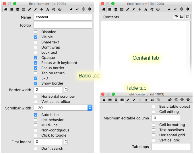
Field-specific properties in various sections
of a field property inspector.
- Basic Properties: Don’t wrap. By default all text typed in a field will automatically wrap to the next line when the end of the field is reached (i.e., it will insert soft returns). Checking this will cause all text to be confined to one line unless interrupted by a hard return.
- Basic Properties: Lock text. By default a field is not locked and a person can enter text into it (as evidenced by the mouse cursor changing to an “i-beam” when the mouse is positioned over the field). When checked the user cannot type in the field, i.e., they cannot alter whatever you may have put in that field, so if you are using a field to display information that you don’t want the user to change, make sure you lock that field.
- Basic Properties: Focusable. Enables a user to tab into the field for editing, if the field is not locked. If the text is locked the user can select text and scroll within the field if this box is checked. If not checked, a user cannot type or select text.
- Basic Properties: Scrollbars H/V. Selecting either one of these will give the field a scrollbar that allows the user to scroll through the information in the field.
- Contents. The field at the bottom of the palette displays the text in the field. Text may be added/edited here (even if the field is locked).
- Table: Text baselines. Checking this option will give the field the appearance of lined paper.
- Table: Tab stops. Providing a value here will allow one to set tab stops using the tab key. The number given is the stop position in number of pixels from the left edge of the field.
Graphic
The available properties change depending upon the type of graphic object. All of them have to do with physical attributes of the graphic and allow you to change those properties manually here.
- Basic Properties: Style. Allows one to alter the type of graphic without creating a new one. For instance, you can change an oval graphic into a rectangle graphic by setting this property.
- Basic Properties: Antialiased. When checked, smoothes out the "jaggy" appearance of curved and angled lines by filling the jags with lighter colored pixels of the same hue.
An antialiased graphic compared to a non-antialiased graphic.
- Basic Properties: Line thickness (sometimes referred to as lineSize). This number determines the thickness, in pixels, of the line that describes the shape of the graphic.
There is an object hierarchy in LiveCode through which properties settings are passed or “inherited,” much like physical characteristics and personality traits within a biological family. Properties for a particular object are “inherited” from another object higher in the hierarchy. It may be viewed in terms of ownership: Stacks contain and therefore own cards and groups, which in turn contain and own control objects such as buttons, fields, images, etc. In biological terms, stacks are grandparents, cards and groups are parents, and buttons and fields are the children. Properties are passed or inherited through that hierarchy. Consequently, if a stack has a particular property value, then all objects owned by that stack inherit the same property value. Changing that particular characteristic subsequently changes the property for all objects below that object in the hierarchy (here the biological metaphor breaks down). Property values are passed only down the hierarchy. They never move up, nor do they affect objects that exist together on the same card.
There are a few inherited properties whose effects are obviously noticeable:
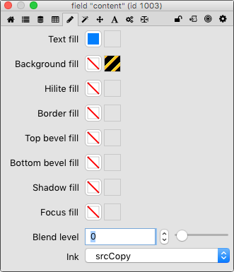
The Colors (and Patterns) tab for a field object.
When these properties are not set for an object they are determined by inheritance from parent objects. There are many colors that may be chosen for any given object, and there are several different aspects of the object you can select colors for. The most common properties you might want to change for an object are the foreground (text, border) and the background (interior fill). For most objects the foreground color determines the color of the text being displayed by the object, or the color of the stroke or border of the object. The fill color, of course, indicates the interior color of the object itself. There are variations between objects and within object types, which you will readily see as you experiment with color settings. Once a color has been set for an object, you can clear the color value by right-clicking on the color property box and choosing Reset to default. When you clear a color property the object will again inherit that property setting through the object hierarchy.
In this tab you can also choose patterns to fill the background or other color areas of the object. The pattern selection boxes are in the righthand column, while the boxes in the lefthand column are for selecting colors. Note that you can only have a color or a pattern selected for any given fill property. For instance, selecting a background color for an object will supercede any pattern fill for that object’s background.
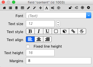
The Text Formatting property pane for a field object.
The properties in the Text tab determine how the text for the object is displayed (i.e. font, size, alignment within the object, etc. You can also change the margins surrounding the text in an object. As mentioned before, when these properties are set for stack, card, and group objects, these settings inherited by all child objects in their hierarchies, assuming those properties have not been set for the child objects.
As hinted at previously, there are so many other properties that we cannot adequately cover them here without causing you drastic overload. Please take the time to experiment with the various objects and determine how these and other properties alter the appearance and function of the various objects.
Object/Property Exercise, Part 2